Why Your White Logo Prints Dirty on a Kraft Bag
You approved crisp white artwork on a screen, and the kraft bags arrived with a logo the color of old paper. Nobody made a mistake at the press. Printing ink is translucent by design, so on a brown bag the brown is still there underneath every color you print. Once you know that, kraft becomes one of the easiest materials to design for instead of the most frustrating.
Overview
You approved the artwork on a screen. The logo was bright white, the colors were rich, and the kraft background gave the whole thing that warm, natural look you were after. Then the bags showed up and the white looks like old paper. The red went brick. Everything reads a little dull, as though it were printed through a film of dust.
The usual reaction is that the printer used the wrong white, or that the file was bad. Almost always, neither is true. What you are seeing is a property of printing ink itself, and it catches brands out on kraft more than on any other material. Once you understand why it happens, kraft stops being the material that ruins your logo and becomes one of the easiest surfaces to design for.
Printing Ink Is Translucent, Not Paint
This is the single fact that explains everything else, and it is worth sitting with for a second.
Paint covers what is underneath it. Printing ink is built to do the opposite. Inks are made translucent on purpose, because that is how printing works at all: a press lays down a small number of colors and overlaps them in tiny dots to create every other color. If each ink were fully opaque, the one printed last would simply bury the ones before it and you could never mix anything.
That design choice has a consequence nobody mentions until it bites. Whatever sits beneath the ink is still contributing to the color you see. On a white film or a white coated board, the brightness in your artwork is coming from the material, not from the ink. The press is not printing white at all. It is leaving the material alone and letting it show through.
Kraft is brown. There is no white underneath to borrow, so every color you print has brown mixed into it.
What Brown Does to Every Color
Once you know brown is in the mix, the shifts you see on a kraft bag stop looking random and start looking predictable.
- Whites and very light tints go cream, tan, or grey, because a translucent white over brown is just a slightly lighter brown.
- Reds and oranges pull toward brick and rust, which can actually look wonderful if you planned for it.
- Blues, purples, and greens go muddy and slate, since brown is working against them on the color wheel.
- Yellows and pastels lose the most and can nearly vanish, because they have the least strength to begin with.
- Blacks, deep browns, and rich earth tones look excellent, because the substrate is pushing them in the direction they were already going.
Notice that this is not a list of problems. It is a list of behaviors. Several of them are the exact reason brands choose kraft in the first place. The trouble only starts when a design assumes a white background that is not there.
White Is the Hardest Color on Kraft
Every color shifts, but white is the one that generates the phone call, and it is the one with nowhere to hide.
With any other color you have some room to adjust. A red that goes brick is still clearly red, and most people will never know it was not the red on your screen. White has no such forgiveness, because the entire point of white is that it is the brightest thing on the bag. When it comes out as weak cream against brown paper, it does not read as a design choice. It reads as a printing defect, or worse, as a bag that has been sitting in a warehouse for two years.
Fine white type suffers the most of all. Thin letterforms and small text give the ink the least area to build any strength, so a delicate white wordmark on kraft can come back looking smudged and broken even when the press ran perfectly.
The Fix Is an Opaque White Underprint
There is a straightforward answer, and it is what every clean, bright graphic you have ever seen on a kraft bag is actually doing.
Before the color goes down, the press lays an opaque white layer in the exact shape of the artwork that needs to be bright. That white is formulated to cover rather than to blend, and it is often laid down more than once to build enough strength to hide the brown. Then your colors print on top of that white, which now acts as the white background the artwork was designed for. The brown is still there everywhere else on the bag, so you keep the kraft look, but your logo and your key graphics sit on their own clean base.
The simplest way to picture it is that the press is printing a small white label directly onto the bag, in precisely the shape your art needs, with no edges and nothing to peel. Because it is an extra layer rather than a different ink, it is a production step worth raising early rather than discovering at proof. Both digital and rotogravure presses handle an opaque white, though they get there differently, and our guide to digital versus rotogravure printing covers how that choice shifts with run size. On a short digital run you can see the result on real board before committing to full production.
When You Should Skip It Entirely
An underprint is a tool, not a requirement, and reaching for it every time throws away the reason you picked kraft.
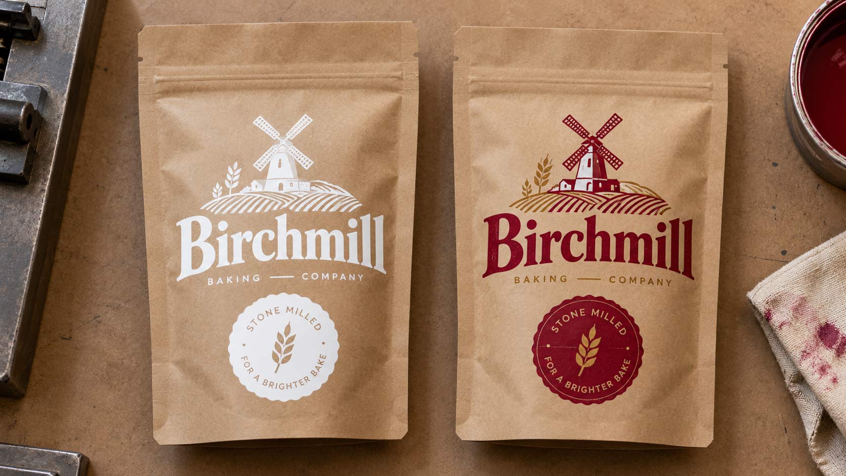
Plenty of the best kraft packaging never uses one. If your brand is leaning into an earthy, honest, small batch look, printing one or two dark colors straight onto the bare board is cheaper, faster, and frankly more convincing than a glossy white panel. The kraft becomes part of the palette instead of an obstacle. You can also knock your logo out of a printed dark block, so the shape of the letters is formed by bare kraft showing through, which gives you a crisp mark with no white ink at all. It is the look a lot of cookie and bakery brands land on for exactly this reason.
The decision comes down to one question: does your brand need to look bright and modern, or warm and natural? Both are good answers. The expensive mistake is designing for one and printing on a material set up for the other. This is also where kraft intersects with sustainability, since the uncoated, recyclable look is often the whole point, and burying it under a full flood of white undoes some of that. Our overview of choosing food packaging walks through where that trade sits against the other format decisions.
Designing Art That Survives the Trip to Brown
A few habits make kraft behave, and they cost nothing if you apply them while the artwork is still open.
- Give white type more weight than you think it needs, and avoid hairline strokes and small serif text in white.
- Avoid light tints and soft pastel gradients, which lose the most strength against brown.
- Build the design around a limited palette of strong, saturated colors, which hold up far better than delicate ones.
- Decide early which elements genuinely need an opaque white base, rather than flooding the whole bag with it.
- Check your logo in a single flat color, since a version that works in one ink almost always works on kraft.
None of this means designing a worse bag. It means designing for the material you actually chose, the same way you would adjust artwork for a dark t-shirt rather than a white one.
Ask for a Proof on the Real Material
The last step is the one that prevents the surprise, and it is the cheapest insurance in the whole process.
A screen is backlit and shows you pure white light. A PDF proof is being viewed on that same screen, and a desktop print comes out on bright white paper. None of those three can tell you the truth about how your art will sit on brown board. What tells you the truth is a printed sample on the actual substrate, so you can hold it under normal light and see the real shifts before you commit to a full run.
If you are putting together a new custom food packaging program on kraft, ask for that sample as part of the approval, and look specifically at the white, the lightest tint in your palette, and any small type. Those three will tell you immediately whether you need an underprint or whether the design is already working with the brown instead of against it.
Wrapping It Up: Brown Is a Color, Not a Background
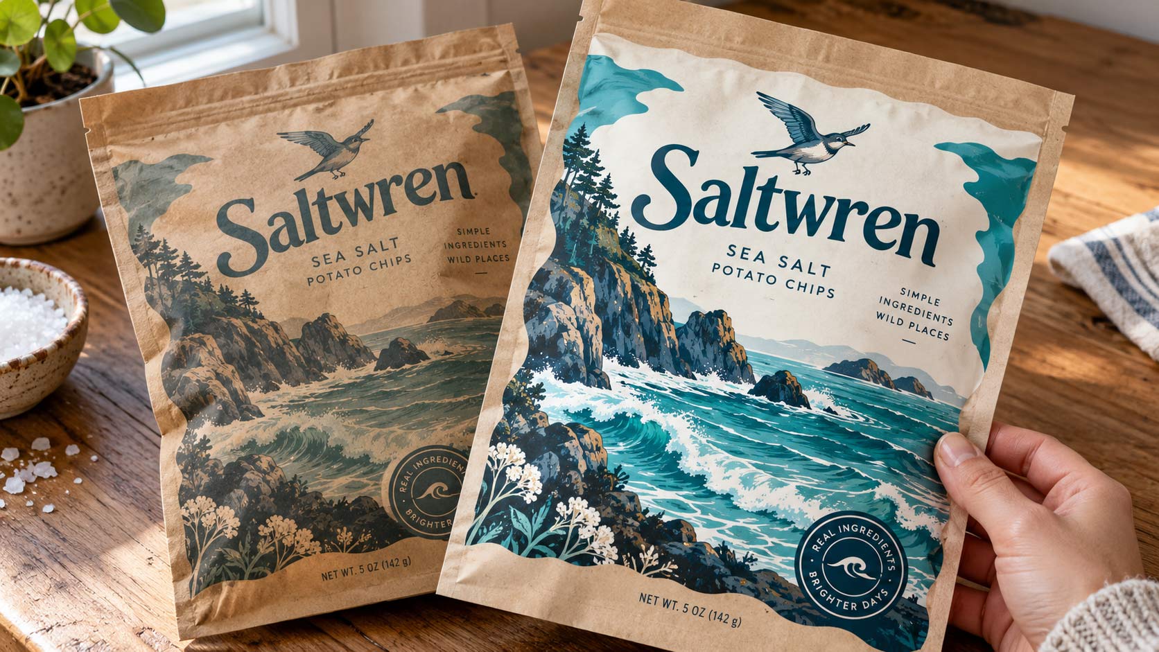
The reason kraft surprises so many brands is that everyone treats the bag as a blank page, and a kraft bag is not blank. It is brown, and brown is already a color in your design whether you planned for it or not. Every ink you print is going to be mixed with it.
Work with that and the material is a gift. Choose strong, saturated colors, let the dark tones go rich, knock your logo out where you can, and add an opaque white base only where the artwork genuinely has to read bright. Then ask for a proof on the real board before the run, not a PDF on a glowing screen. Do that and the bag arrives looking like the thing you approved, warm and natural on purpose, with a logo that reads clean across the room.


Ready to Create Packaging That Elevates Your Brand?
Let's bring your product to life on the shelf.
Get a Free Quote